At Nort Labs, we’ve seen the digital landscape transform dramatically over the past decade. Gone are the days when websites were built solely for desktop viewing. As a tech company developing solutions for clients across sectors, we’ve learned that your digital presence must adapt seamlessly to everything from expansive desktop monitors to the palm-sized screens of smartphones.
Responsive web design isn’t merely a technical nicety—it’s absolutely fundamental to delivering content effectively. We’ve witnessed firsthand how businesses struggle when their beautifully designed desktop sites render poorly on mobile devices. The consequences? Frustrated visitors who bounce quickly, damaged brand perception and, ultimately, lost conversions. Google has made their position crystal clear too—mobile-friendly sites receive preferential treatment in search rankings, making responsive design a critical SEO factor.
Core Elements of Proper Responsive Design
Through our development journey at Nort Labs, we’ve found these principles to be non-negotiable:
Proportional layouts are essential—rather than fixed-width designs, percentage-based structures allow content to breathe and adjust naturally across different viewports.
Images need careful handling—they must scale appropriately within their containers without compromising quality or creating layout issues.
Media queries remain the backbone of responsive development—these clever CSS rules help sites transform intelligently based on the visitor’s specific screen parameters.
And we cannot stress enough the wisdom of taking a mobile-first approach. When you begin by designing for smaller screens, you’re forced to prioritise what truly matters, creating a foundation that can be thoughtfully enhanced for larger displays.
The Real-World Challenges We Faced
Before discovering Responsively App, our team at Nort Labs struggled with the same headaches that plague developers everywhere. The sheer variety of devices on the market made comprehensive testing a nightmare. Performance optimisation became increasingly complex when trying to deliver fast experiences across wildly different network conditions and processing capabilities.
Perhaps most frustrating was the ongoing maintenance—just when we’d perfected our responsive layouts, new devices with unusual screen dimensions would hit the market, potentially breaking our carefully crafted designs.
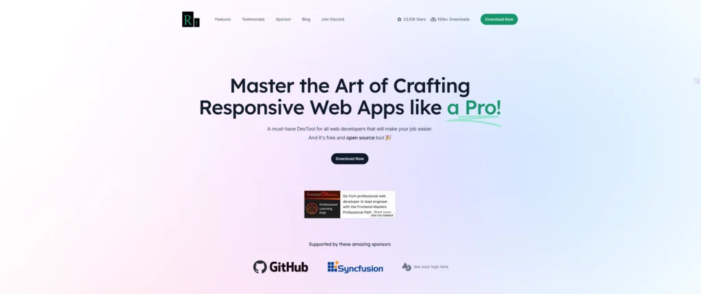
Responsively App: The Tool That Changed Everything for Our Team
This brings us to the tool that has completely transformed our development workflow at Nort Labs: Responsively App. This brilliant piece of software addresses the most painful aspects of responsive testing, and we simply cannot praise the team behind it enough.
What makes it special? Rather than toggling between different device views or maintaining a physical device lab, Responsively App lets us preview websites across multiple screen sizes simultaneously in a single window. And the most remarkable part? It’s completely free—a testament to the team’s commitment to improving the developer experience for everyone.
Standout Features That Save Our Developers Hours Daily
The multi-device preview capability alone has been revolutionary for our workflow. We can instantly see how designs respond across phones, tablets and desktops, spotting inconsistencies immediately rather than discovering them later in the development cycle.
We particularly value the ability to create custom device profiles that match our clients’ target audiences, ensuring we’re optimising for the right viewports.
The synchronised interaction feature is genuinely clever—when we scroll or click on one device view, the action mirrors across all views, giving us a true sense of the user experience across devices.
Live reloading has saved our team countless hours of manual refreshing. Whenever we tweak CSS or HTML, the changes appear instantly across all device previews.
For deeper troubleshooting, the integrated Chrome DevTools provide familiar debugging capabilities without leaving the application.
Our Heartfelt Thanks to the Responsively App Team
We at Nort Labs feel it’s absolutely essential to acknowledge the extraordinary team behind Responsively App. Creating and maintaining such a high-quality tool—and offering it for free—requires tremendous commitment and expertise. Their contribution to improving responsive development workflows deserves not just recognition but genuine appreciation from the entire web development community.
The dedication shown by the Responsively App team exemplifies the best aspects of innovation in our industry. They identified a universal pain point and crafted an elegant solution that benefits developers everywhere, regardless of company size or budget constraints.
Closing Thoughts from Our Experience
After implementing Responsively App across our development teams at Nort Labs, we’ve seen marked improvements in both efficiency and output quality. Our responsive designs are more robust, our testing is more thorough, and our developers are significantly less frustrated by the challenges of multi-device compatibility.
If you’re serious about creating websites that truly work across devices—and as professionals, we all should be—we at Nort Labs strongly recommend incorporating Responsively App into your development toolkit. Your workflow will thank you, your developers will be more productive, and most importantly, your clients and their users will benefit from truly responsive experiences.
Responsively App stands as proof that sometimes the most valuable tools come without a price tag, thanks to passionate developers who genuinely care about advancing our craft.


